Website Builder
Time is money. Use our website builder to create an amazing website and save both time and money!
Create a Beautiful Website in Minutes!
Creating a website doesn’t have to be difficult or expensive. Our Website Builder makes it easy to create an impressive website without knowing how to code. You’ll have your website up and running in minutes!
Select one of our website builder plans and get started today! If you plan to sell online, check out our Online Store builder.
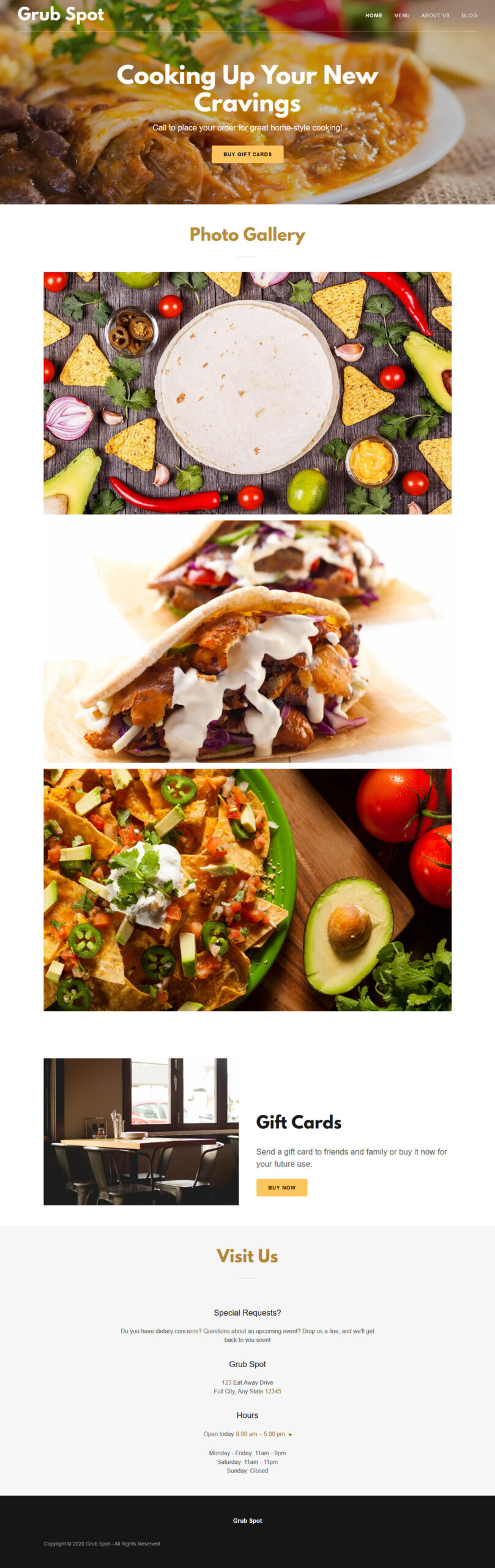
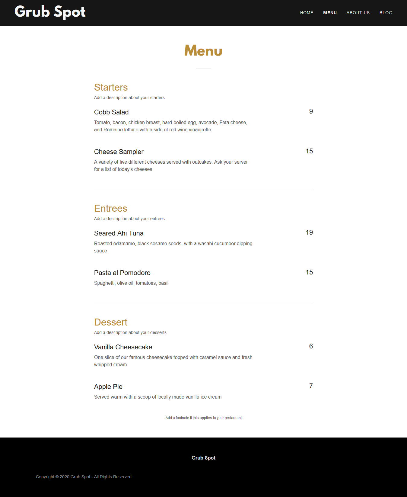
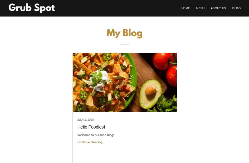
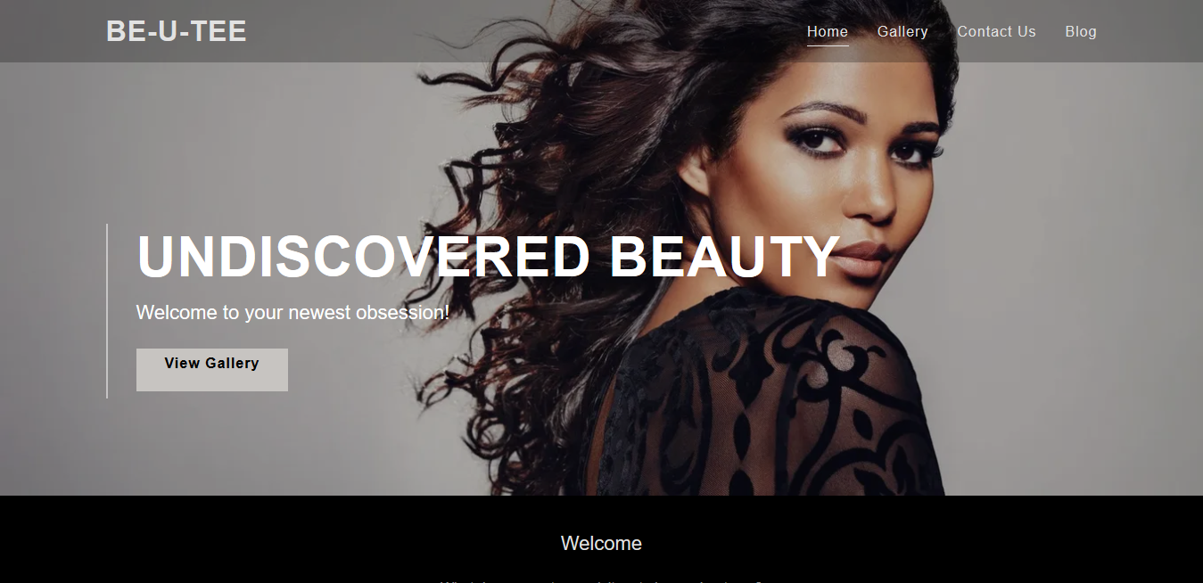
We have a wide variety of designs to fit your needs:
- Beauty/Nail Salons
- Non-Profit Organizations
- Food Trucks & Caterers
- Personal Websites
- Consultants
- Travel Blogs
- Photographers
- Cleaning Services
- Accounting/Financial Services
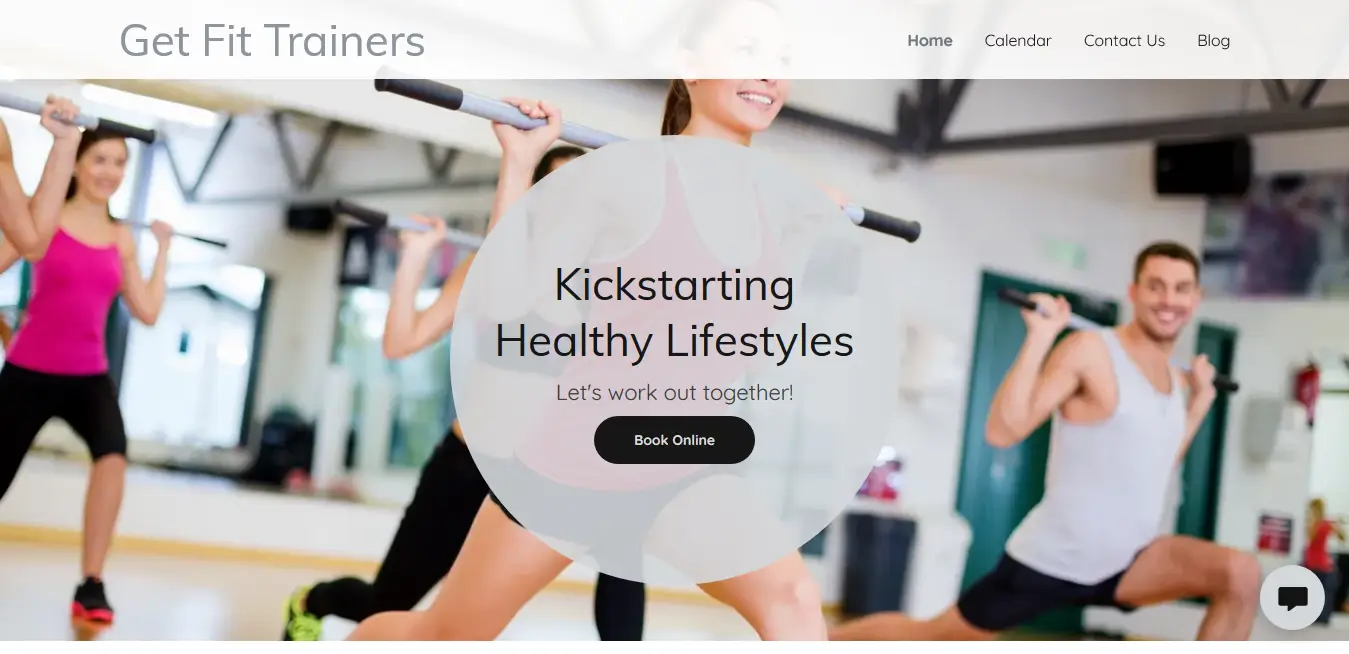
- Personal Trainers
- Counseling
- Designers
- Handyman Services
- Contractors
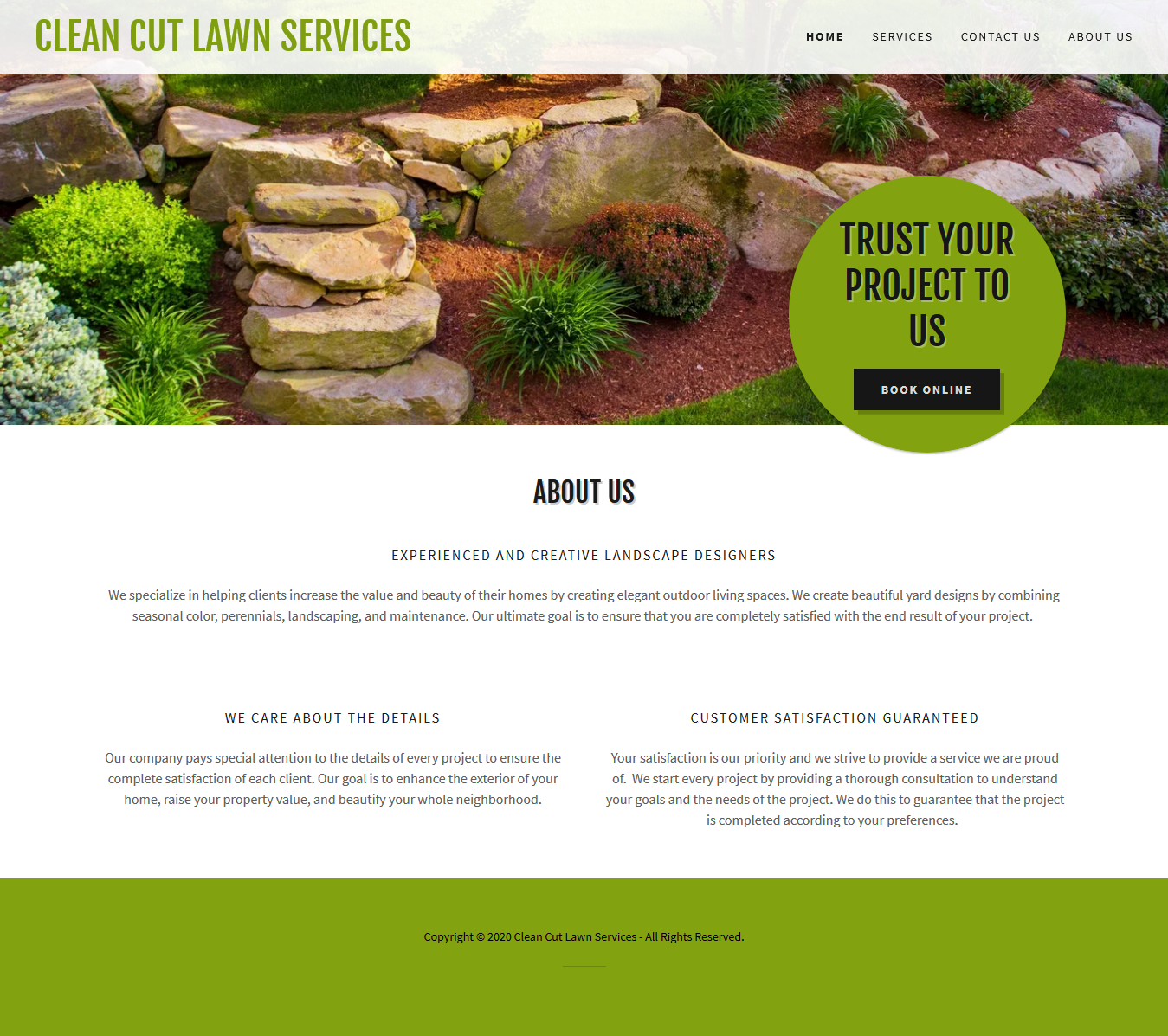
- Lawn Care/Landscapers
- Fashion/Beauty Blogs
- Tutoring/Educational Services
- Commercial & Residential Service Providers
Our Website Builder Plans Include:
- Web Hosting
- Website Backups
- Menu & Price Lists
- GoFundMe Fundraising
- File Downloads for Visitors
- FREE SSL Certificate
- Professional Designs
- Mobile Responsive Sites
- Customized Favicons
- Blogging
- Hassle-Free Renewal Discounts
- Analytics & Tracking
- Calendar Integration
- Photo Galleries
- 24/7 Support
Book Appointments (Business Plus Plan)
- Book one-time appointments
- Book recurring group events and classes
- SMS alerts for new appointments
- Email and text appointment reminders
- Accept online payments for services

Mobile Friendly vs. Mobile Responsive
Mobile friendly websites have a standard “mobile” version of their website that’s the same on all mobile devices. Problem is, cell phones and tablets come in different sizes and operating systems. What looks good on one device may not look good on another.
Mobile responsive websites are optimized for the mobile devices they are being viewed on. They’re “responsive” because they automatically adjust the content to fit the device. No need to worry about how your website looks on cell phones and tablets!


Search Engine Optimization
(Business & Business Plus Plans)
Search Engine Optimization (or SEO) is the process of optimizing your website to improve search engine ranking and increase web traffic. SEO is one of the factors Google takes into account when ranking websites, so this is important to consider when building your website. Our SEO simplifies the process and guides you through selecting keywords and optimizing your site.
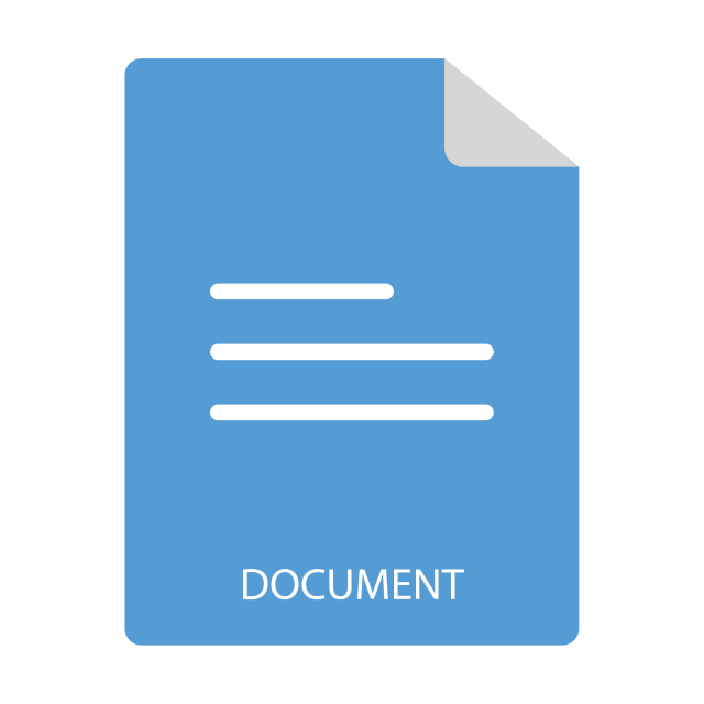
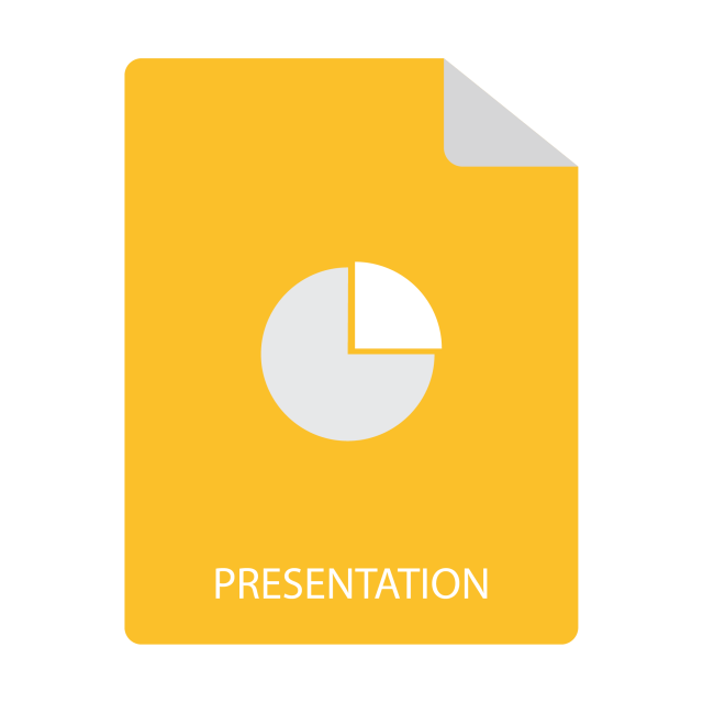
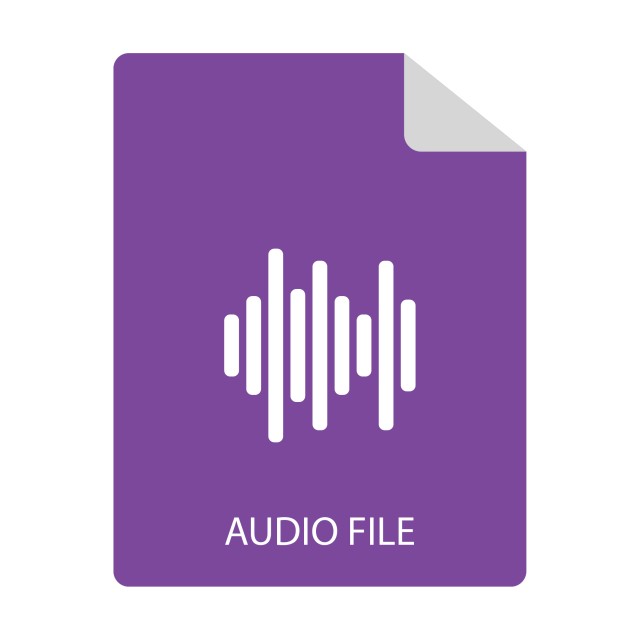
Have files you want to share?
Add a Downloads section!
Upload documents, catalogs, brochures, manuals and more to your website for visitors to download. It’s an easy way to share information without having to manually send out files.


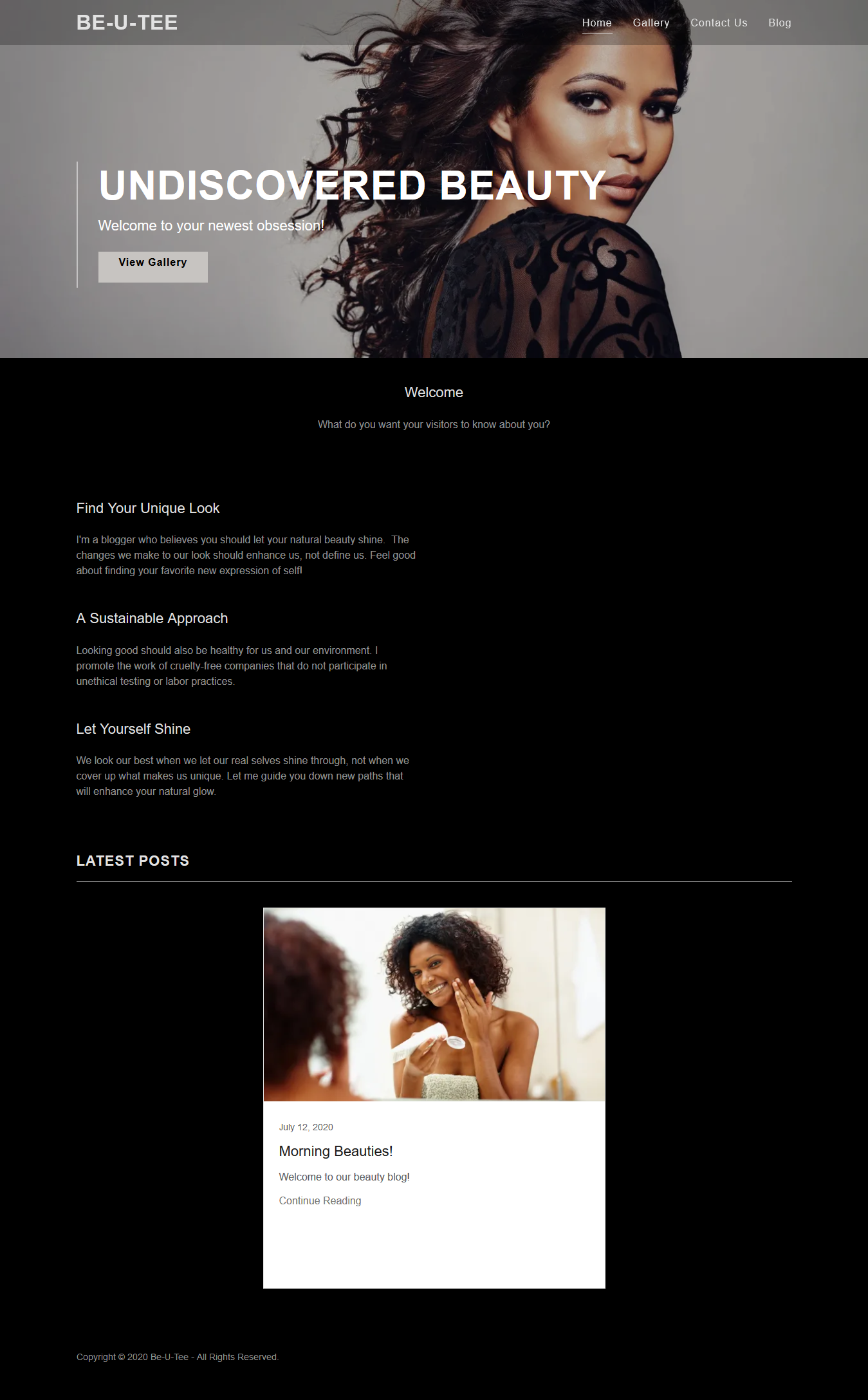
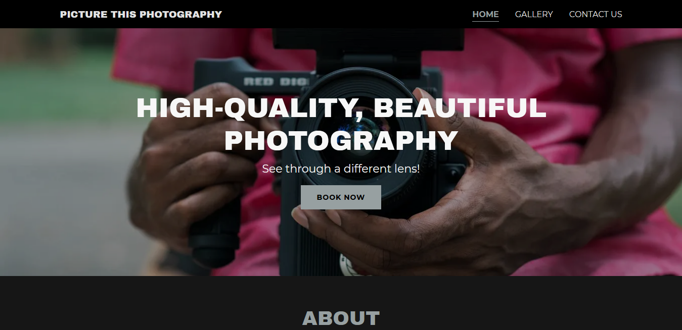
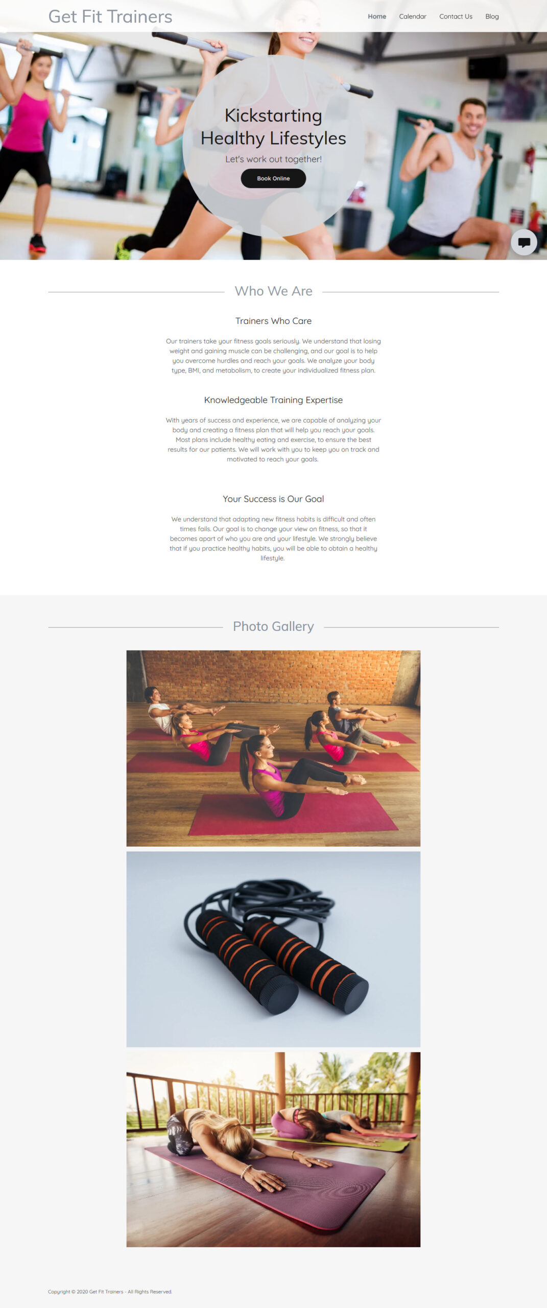
Sample Theme Designs
Money-Back Guarantee
We want you to be happy with your website. If for any reason you aren’t satisfied with your purchase, we’ll refund your money. Request a refund within thirty-days of purchase for annual plans or within forty-eight hours of the date of purchase for plans less than a year. Please see our Refund Policy for more details.